Gradient / digital light01
#938DF9 → #5B4FEBRGB
Public brand reference
A practical reference for a precise Belgian performance-marketing studio. Use it to keep every touchpoint calm, confident and unmistakably Saerens.
Consistency is not decoration. It is how a specialist becomes recognisable across a proposal, a campaign report, a landing page and a conversation. This system keeps the details aligned while leaving room for the work to lead.
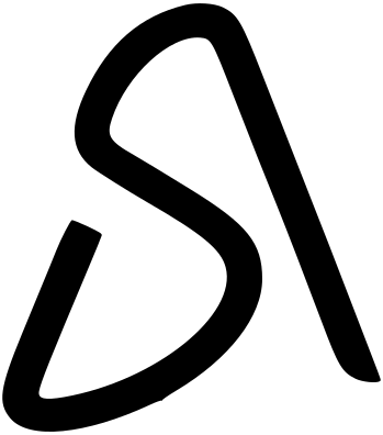
The geometry never changes. Select the finish that belongs to the context, and give the mark enough space to remain clear.
Keep the proportions, clear space and colour relationship intact. Use the gradient on calm light surfaces or Obsidian when contrast stays clear; choose monochrome for one-colour applications and print.
Do not stretch, rotate, outline, recolour or place the mark on a surface that weakens its contrast. Never rebuild the gradient by eye.
Indigo carries the energy. Obsidian gives it somewhere to land. These values are the source of truth across screen and print.
Use dark surfaces when the work needs focus. Keep borders restrained, text warm and accents purposeful.
Obsidian #070B14 is the primary dark surface. Near Black #0A0A0B supports high-contrast moments, print and monochrome applications.
Use the gradient or Light Indigo for orientation, status and emphasis. Never let the accent compete with the message.
Plus Jakarta Sans carries headings and high-emphasis statements. Outfit keeps interface text, labels and body copy open and legible.
The public interface is concise, confident and specific. It avoids inflated promises in favour of a clear point of view.
Lead with what changes, what is measured and what happens next.
Use the shared small, medium and large radii with quiet one-pixel borders. Rounded does not mean inflated.
Use simple line icons, the mark, gradient and restrained motion to guide attention. Every signal should clarify the next action.
“Clear signals. Considered rhythm. Work that moves the metric.”
Use the canonical artwork below. Keep the supplied geometry intact and choose the file for its intended medium.